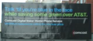
Dug through my archives and found this old Comcast ad occupying the afore-mentioned billboard. While faithful Good/Bad followers will know I love a good pun as much as the next guy, the blue and green font on black background really make it hard to read. And there's just too much copy here. Isn't the golden rule 7 words max on a billboard? I hate to pick on Comcast again, especially since I know their agency does some really good work (love the Comcastic spots) but they're 0 for 2 so far on this blog. This one reminds me of that old joke -- what's black and blue and read all over? Not this ad.

No comments:
Post a Comment