Friday, January 13, 2012

HomeCEUConnection.com


Check out this great direct mail piece. Sent around Christmas-time when everyone's getting holiday cards with just this kind of cute return address label. I'd have to imagine open rates were thru the roof but I bet conversion rates were thru the recycle bin!

Wednesday, January 4, 2012

PPC Associates


Full disclosure: I voted for this ad concept in a survey, David Rodnitzky, CEO of PPC Associates, ran before creating this billboard. That said, I voted for it for a reason... it really drives home the point!

Tuesday, November 29, 2011

Southwest


This isn't an ad per se, but it's a bad sign. Can you see the iStockPhoto watermark in reverse across the image? Either they didn't pay for the rights to this photo or their designer just screwed the pooch.

Friday, November 13, 2009

Windows Vista


I dig this print ad by Microsoft for Vista. Catches your eye. Captures your imagination. Makes it's point. Which, I think, is that the Vista OS has a fun entertainment suite.

Part of me just likes seeing Microsoft pull off a good ad because it's become the underdog in those Mac vs. PC commercials.

Hat Tip to Len Kendall.

Saturday, August 29, 2009

Snickers


Anyone that's kept up with my Good/Bad blogs knows that I like a good/bad pun. This Snickers campaign certainly has its share of both. Overall, though, I like how the ads start to give the wrapper and trademark typeface a brand of its own. The ones on this outdoor ad are 3 of the better ones but my fave of all time is "Get dunked on by Patrick CHEWING." The worst is the one that says CHEWMUTE -- had to have my Twitter followers explain that it was a play on "commute" -- hence the positioning on the side of a bus. Bottom line when it comes to puns -- good or bad -- is you shouldn't have to think. You should see it, get it and either groan or snicker.

Wyoming Tourism

Bad Ad


A good URL can't save this bad ad. Seems like the poor folks in Wyoming haven't been to Chicago in a while. You see, it's not the Sears Tower anymore. Cue Arnold Jackson, "Whatchu talkin' bout Willis?"

Saturday, February 21, 2009

Veet

Good Ad

Sometimes the context of an ad can give it an entirely new meaning. Case and point. Game, set, match.

Sunday, January 25, 2009

Good Billboard Ads

Kris McDermott, Resolution Media Account Strat extraordinaire, pointed me to this page on Toxel.com -- a repository of clever billboards. Here are some of my faves:

Kill Bill

Good Ad

Formula Toothcare

Good Ad

Heineken

Good Ad

Bloom

Good Ad

Maker's Mark

Good Ad

Nestle

Good Ad

Denver Water

Good Ad

Subway

Bad Ad

Methinks this ad backfired. As my wife put it, "They make the fries look too good!"

Sunday, November 30, 2008

Hyman's

Bad Ad

Saw this ad in the airport in Charleston, SC. It's for Hyman's, a seafood restaurant in downtown that was described to me as a "tourist trap." Sure enough, we tried to go there a couple days ago and the line of tourists was around the block waiting to get a table -- much like the picture in this ad. Not sure why you'd want to play that up. Whoever picked this photo must've been high, man.

The Alley

Good Ad

Dig this bench ad for the Alley, a tatoo parlor in Chicago. In case you can't read it, it says, "Get Pierced Not Screwed. Holey moley, that's a great play on words.

Saturday, August 9, 2008

Vitamin Water

Bad Ad

Now I'm just a search marketing guy, so I don't know all that much about how outdoor ads are made but I have to imagine they make glare-free material. Half this ad gets lost for a good couple hours each day when the sun is rising. This billboard is a shining example of what can happen when a good idea meets bad production.

Saturday, August 2, 2008

Comcast #2

Bad Ad

Dug through my archives and found this old Comcast ad occupying the afore-mentioned billboard. While faithful Good/Bad followers will know I love a good pun as much as the next guy, the blue and green font on black background really make it hard to read. And there's just too much copy here. Isn't the golden rule 7 words max on a billboard? I hate to pick on Comcast again, especially since I know their agency does some really good work (love the Comcastic spots) but they're 0 for 2 so far on this blog. This one reminds me of that old joke -- what's black and blue and read all over? Not this ad.

Unknown

Good Ad

Can't tell who this ad is for. Gotta love it though. Really pops out at ya.

Unknown #2

Good Ad

Here's another unidentifiable ad. Was sent to me in the same email as the previous one. You know the 1 out of 50 email forwards you get that's actually worth reading? Thanks to Mr. Lance Neuhauser for spreading the love and cutting thru the clutter of my inbox. This ad is definitely all it's cracked up to be.

Saturday, July 26, 2008

Comcast

Bad Ad

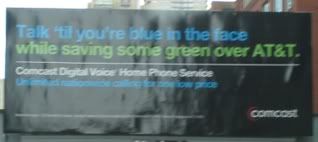
I drive by this billboard every day on my way to work. Comcast has owned the inventory for quite some time. Every month they change out their creative. Their latest campaign is "I'd rather" and the past few months, they've rotated a number of similar executions in this space. Most of them I like. They get the point across. Comcast is so great people would rather do crazy things than give it up. But this one realy misses the mark. It bugged me so much that I finally started up this blog and am using this to set the bar for Bad Ads. Truth is, it's really not all that bad and the message will resonate with many people. That said, it's a great example of the unintentional consequences when marketers and their agencies don't think through all the ways an ad can be interpreted. In this case, someone might think that the reason this college grad has to move back in with his parents is because Comcast is so expensive that he can't afford his apartment anymore. Whoops. I bet Comcast would rather not have that perception out in the marketplace.

Cingular

Good Ad

Now that I've set the bar for Bad Ads, let's set or, to use their recent slogan, raise the bar for Good Ads. Love this high impact ad from Cingular. It's not just "out there" for the sake of being out there. It actually reinforces the message of how annoying dropped calls are. Unfortunately, my experience with Cingular (now AT&T) has been riddled with annoying dropped calls so I'm tempted to deduct points for failing to live up to the promise of their ads but that's a whole different blog I could/should set up. As far as breaking through the clutter of out-of-home and resonating with the audience goes, this ad drops it like it's hot.

Bic

Good Ad

Here's another great out-of-home execution. Really demonstrates the product attributes. Especially like how they didn't overdo it by busying up the billboard. A clean board for a clean shave. This ad is a cut above.

Mr. Clean

Good Ad

Speaking of clean, I love what P&G did here. Like the Bic folks, they resisted the temptation to use copy to get their point across -- must be nice to have a mascot, er... icon that's so recognizable. This ad is so fresh and so clean, clean.

FedEx Kinkos

Good Ad

One more clean ad and then it's back to URL-spotting for me. Great (white) out-of-the-box, er... tube thinking here. Really makes you wanna run up to that bottle and take a good whiff, aye? Great white-out-of-the-box thinking here.